Can’t You Stay Focused?
This article was published on StickyMinds –
“Advocating for the User in Accessibility Testing”, September, 2016.
Do you see a problem?

Can you see the focused link at all? If you can, is it easily distinguishable for you? How close you have to look? Will you instantly find the focused element if you didn’t know where to look for it?
WCAG - Web Content Accessibility Guidelines has this compliance requirement.
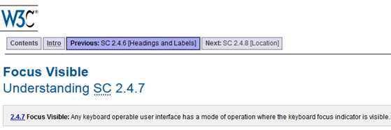
2.4.7 Focus Visible: Any keyboard operable user interface has a mode of operation where the keyboard focus indicator is visible. (Level AA)
Visibility is a subjective criterion. Unfortunately, WCAG doesn’t link explicitly visibility of focus with such requirements as 1.3.3 Sensory Characteristics and 1.4 Color / Contrast.
However, Web developers understanding “the spirit of the law” manage to highlight focus in much better ways.
An example from the WCAG itself.

The particular problem is that default focus can be displayed differently by different browsers, including their versions.
- Even if test infrastructure displays default focus in a visible fashion, end users may experience problems on their devices.
- New browser versions (LOL, except IE) come out very often.
Custom highlighting of the focus is a fairly simple trick, and Internet is full of CSS code examples. However, widgets and frameworks must allow such customization. If a Web site has a complex structure, each representative must be taken care of.
Multiply: all controls times all pages!
This is also a testing problem. How long will it take to TAB the focus through every single control on every single Web page, on all combinations of the popular browsers and their versions?
Tools can’t help with this problem. To my knowledge, there’s no single tool available that in automatic fashion will TAB through the controls and register color/contrast ratio for the focus.
Let’s say your team is up to the task and decided to create a user-friendly, accessible focus highlighting.
Still a lot to test!
Color schemes are also typically expected to be consistent. Same class of controls should be highlighted the same way to avoid confusions.
How will you advocate the impact? One affected control might not be a big deal..

..Even if the focus is completely degenerate? The focus is on the link. Can you see it? (Hint: a thingy in top right corner).
But focus is a BIG deal. Because it’s a constantly used feature.
While not impacting all users, it might be detrimental for User Experience of people relying on clearly identifiable keyboard focus. Even though it does not block the functionality per se the affected users will experience continuous frustration.
Will you report focus problem as a single issue or log hundreds of bugs – one per control?
—
Let’s sum up the problems we’ve identified.
- Web UI controls need clear highlighting when focused. The focus must be “visible”. “Visible” is a subject to interpretation. It will probably be biased by an attitude towards accessibility
- Default focus might be good enough for some controls on some background but we cannot assume that our end users will have the same default focus as in our test environment
- We have a problem with “test early” approach – the bugs can’t be spotted through visual inspection of mock-ups
- The amount of GUI controls to TAB through and inspect might be enormous, especially considering different browsers and versions
- Tools do not perform such type of checking
- Frameworks and widgets might not allow customization of appearance of the focus
- The fashion of highlighting focus needs to be tested for consistency
- Not only color/contrast of focus is a parameter under evaluation but also its shape, appearance on-around of the highlighted control, and location relative to the highlighted control
- Reporting every single bug individually becomes a very time-consuming task. Reporting a bunch of them potentially ends with half-fixed bugs
—
This is the post on problems with accessibility problems. Patterns, anti-patterns, and advocacy.
Stay tuned and follow the series.

